Pride in obsessive care. The exhausting, unglamorous devotion to getting it right, worn as a badge instead of hidden.
[ Work ]

The Feeling
Pride in obsessive care. The exhausting, unglamorous devotion to getting it right, worn as a badge instead of hidden.
The Problem
How do you make a brand worthy of competing with the biggest names in the category, using a trait most companies would hide, not the finished projects, but the exhausting process behind them?
We named that trait "plussing," borrowed from Pixar's own iterative philosophy, and it became the entire foundation of the identity. From there, the wordplay kept compounding: the "u" and "our" inside Bourn itself became a way to fold "you" and "our" into the name's own DNA, and the logo's oval "O" pulled directly from the letterforms in Bourn, an original mark and typeface built from the name rather than borrowed from a template.
In Concert
Every function below worked from that same pride in the process, not just the outcome.
The Result
Leadership ultimately got cold feet on the rebrand. Choosing to be bold and different can feel worrisome, even scary, to some people.
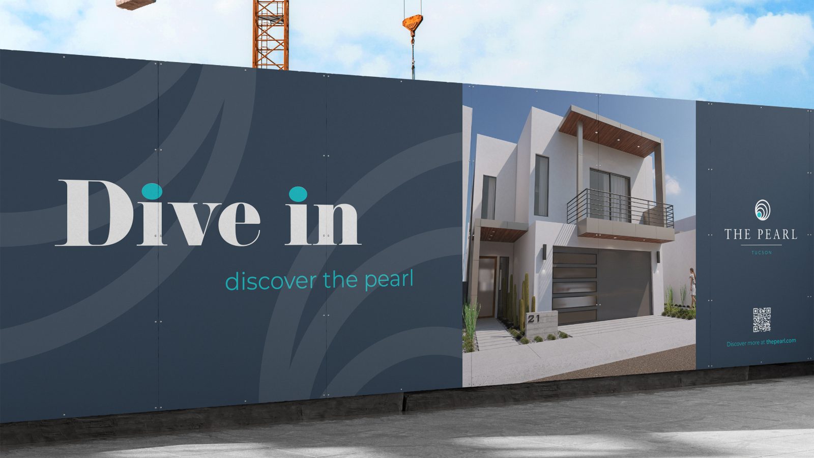
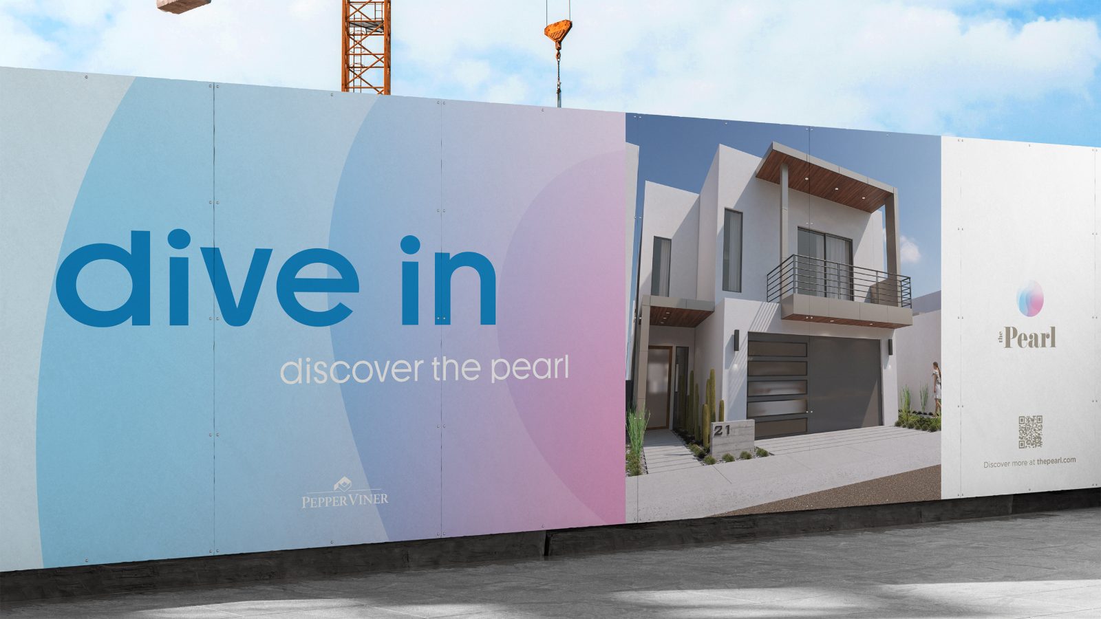
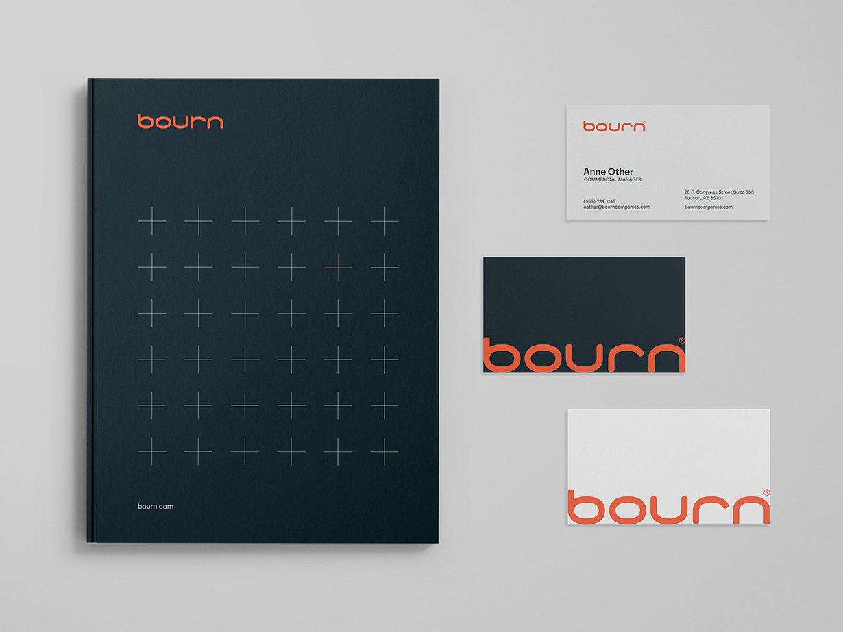
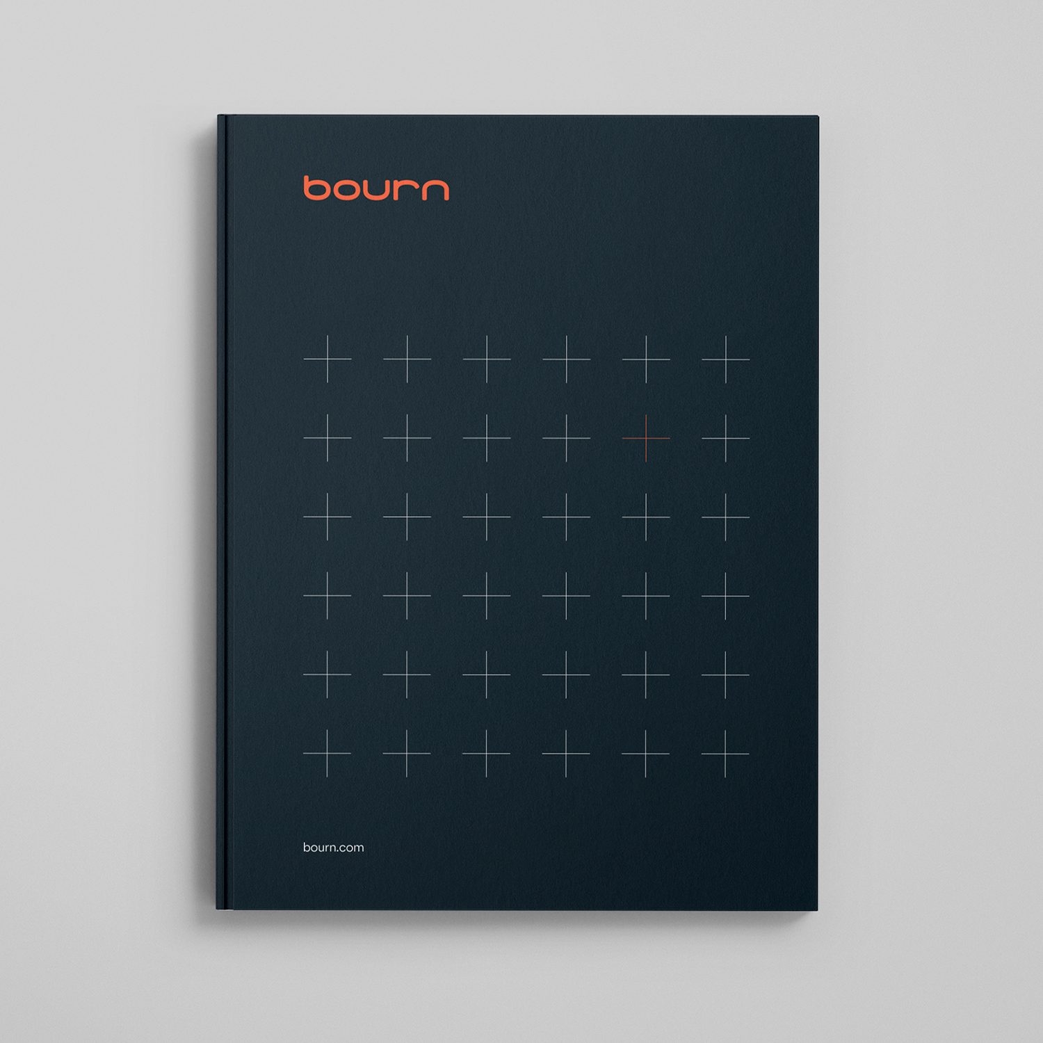
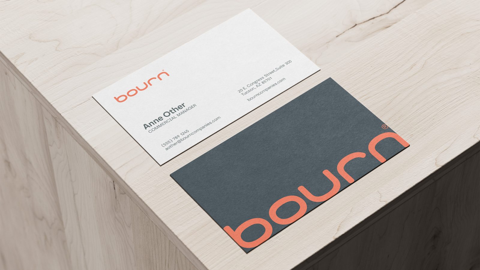
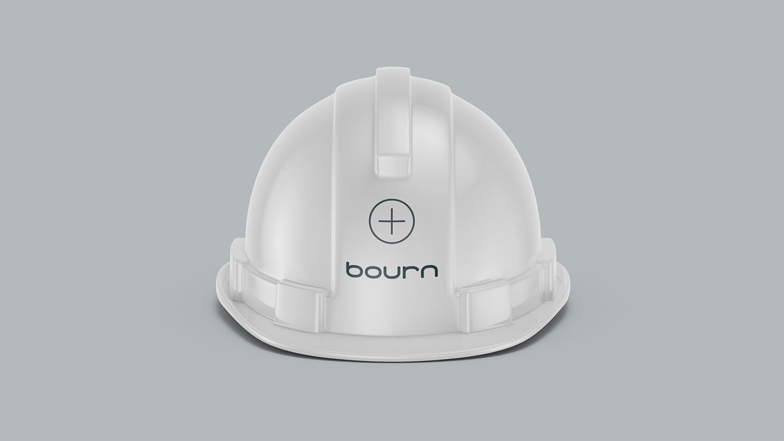
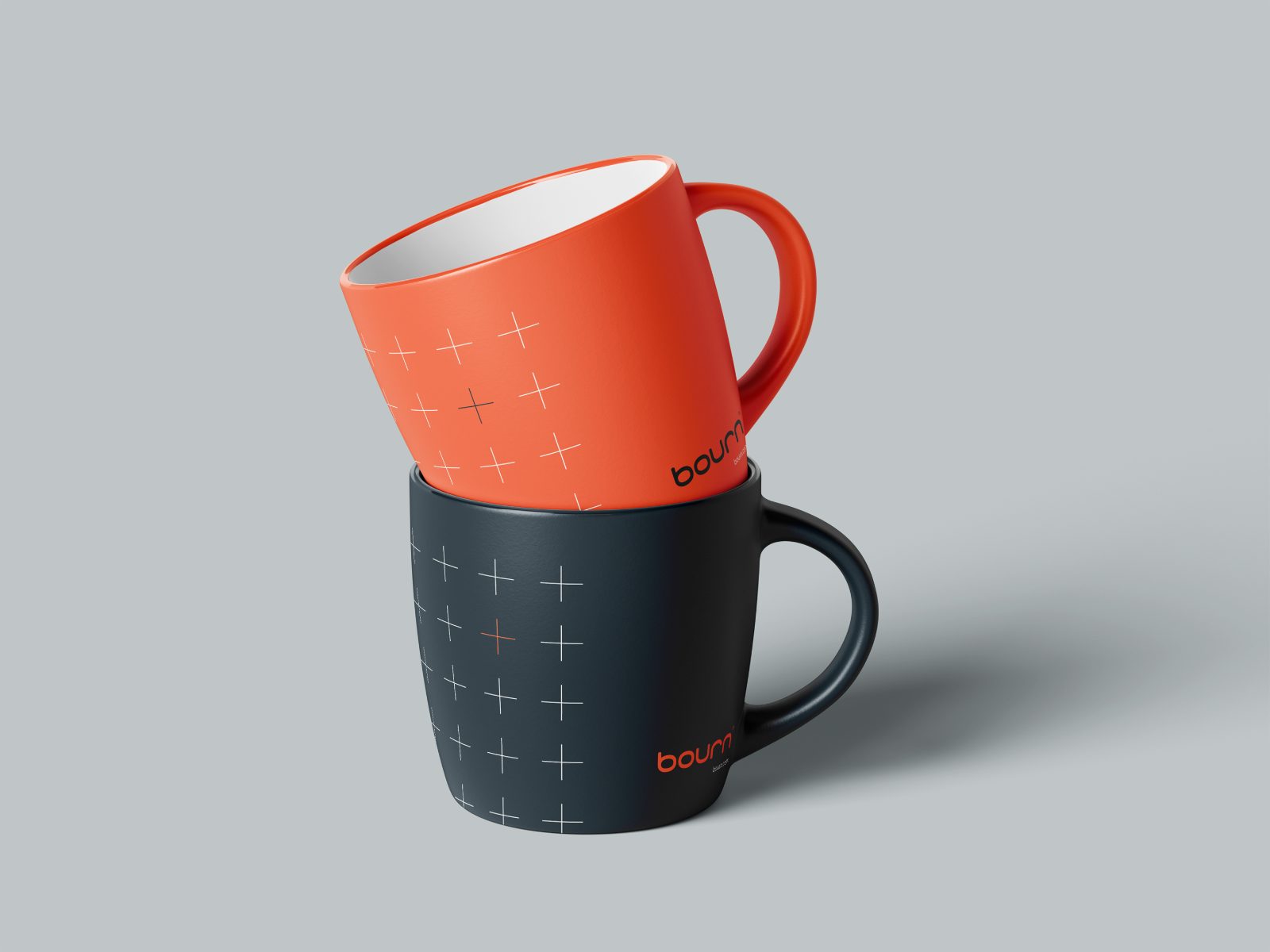
A full rebrand of the Bourn corporate identity, from wordmark through to the signage that wraps their job sites.
Wordmark construction. Muted and looping.
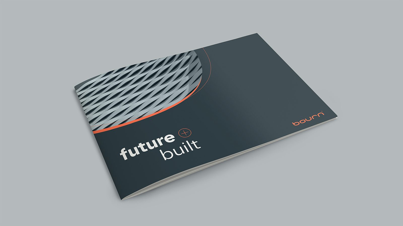
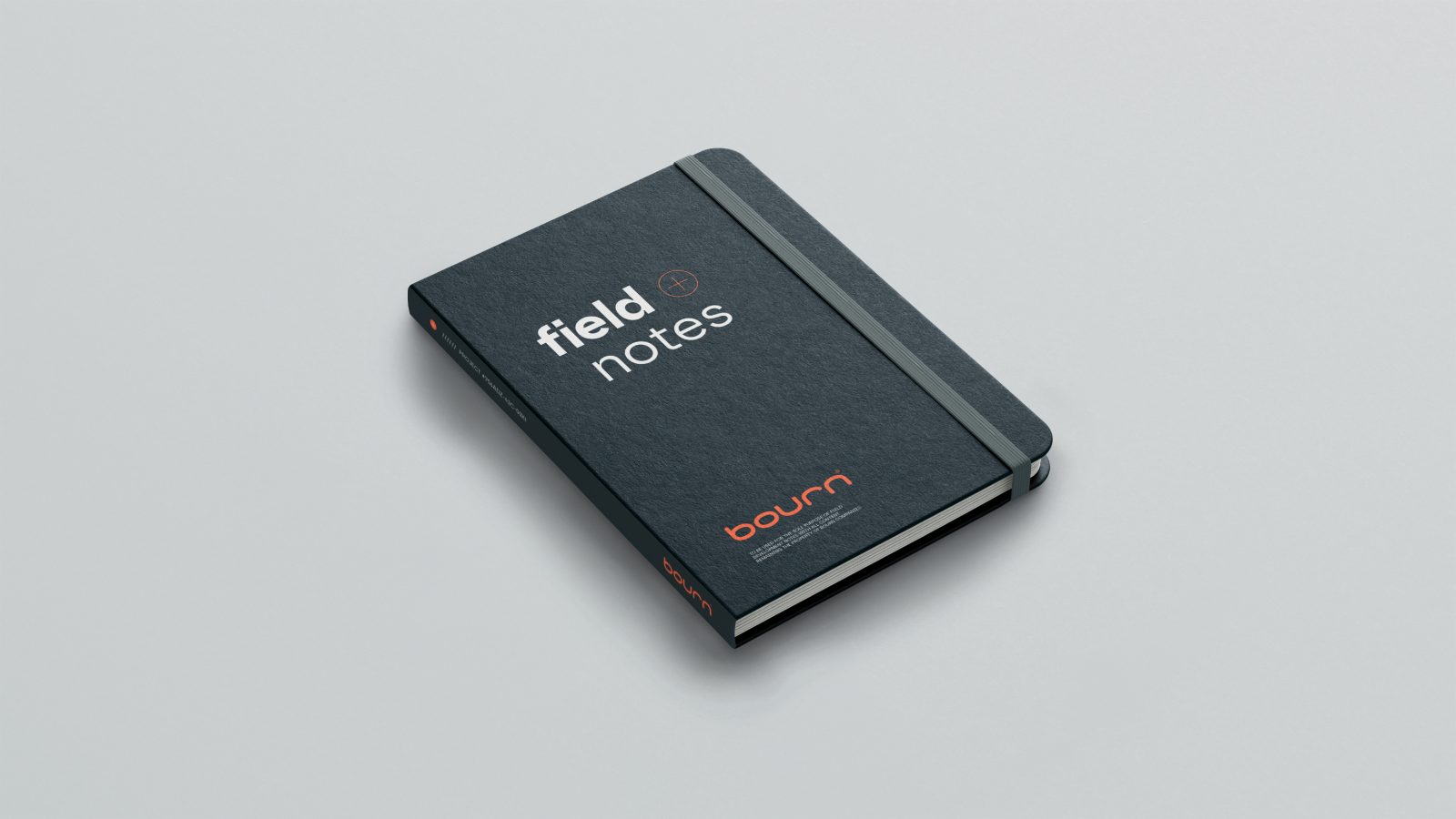
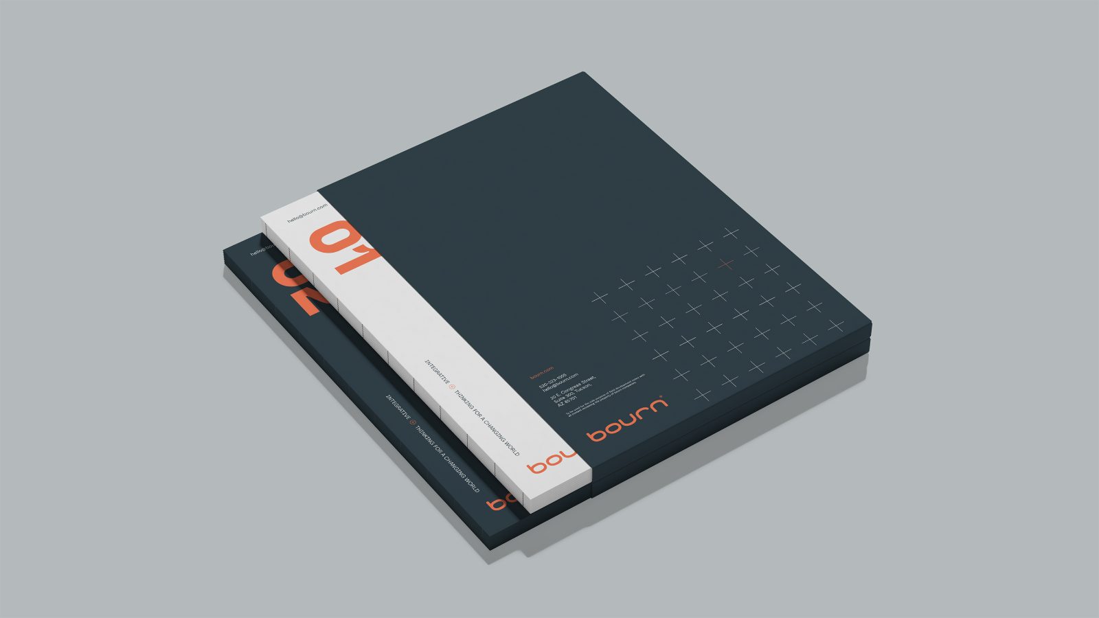
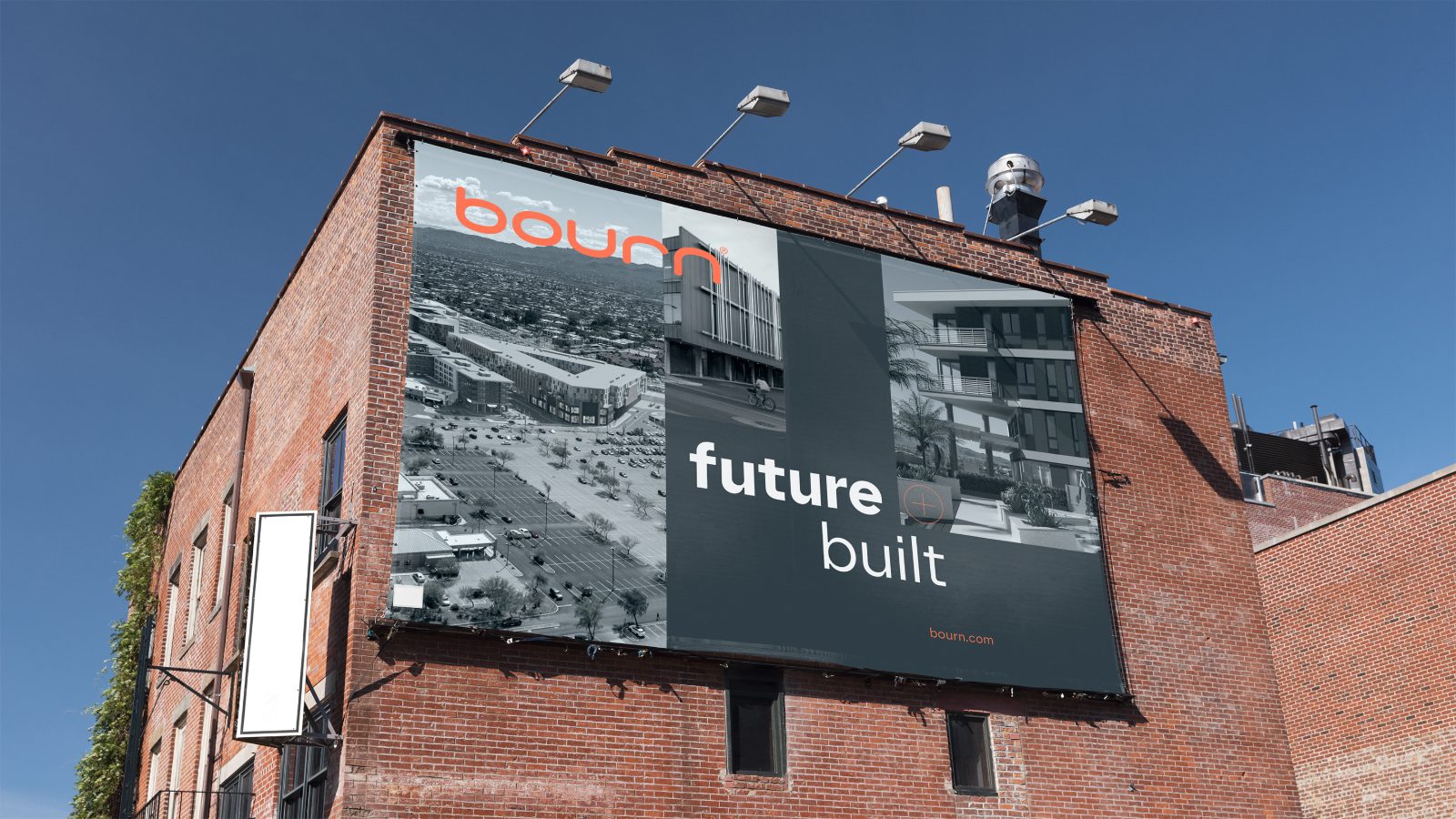
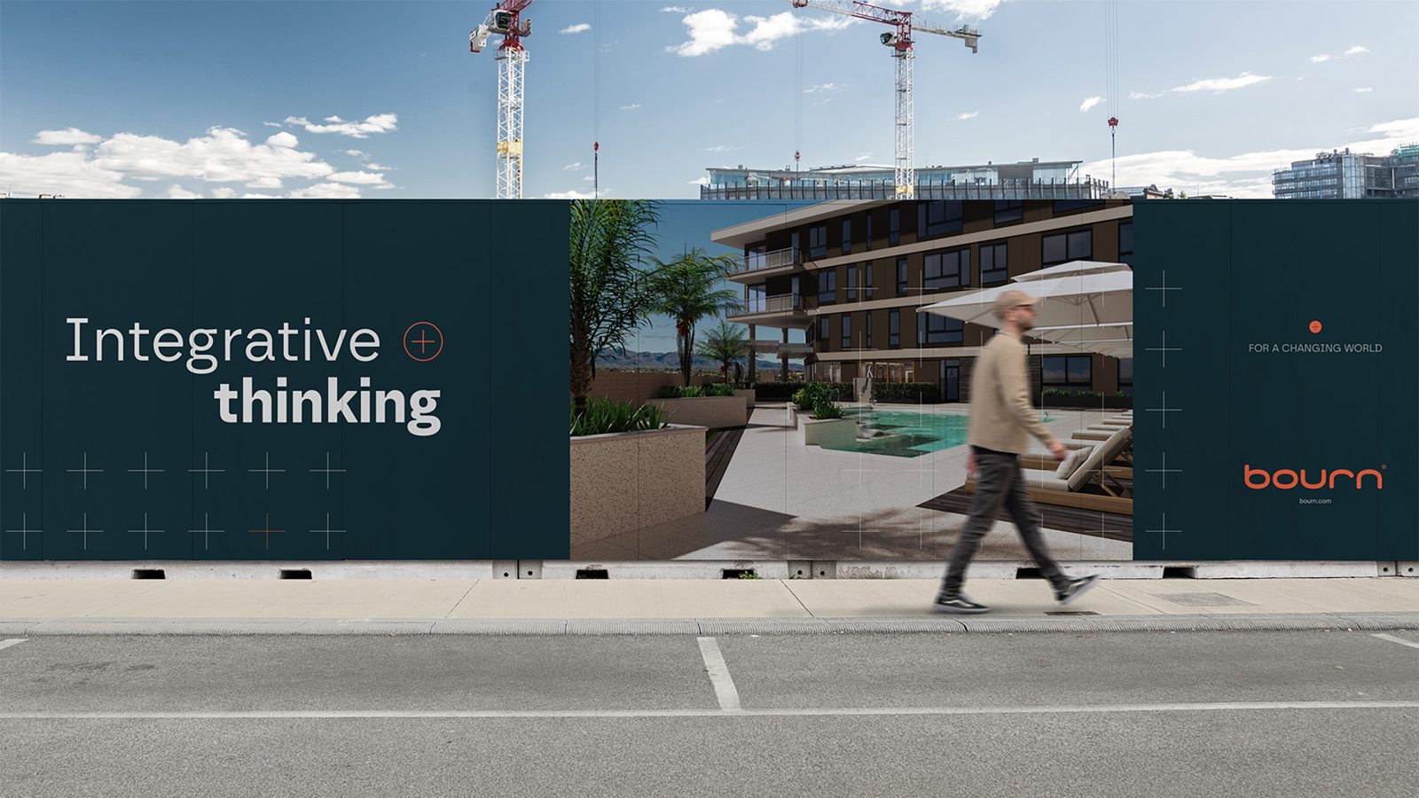
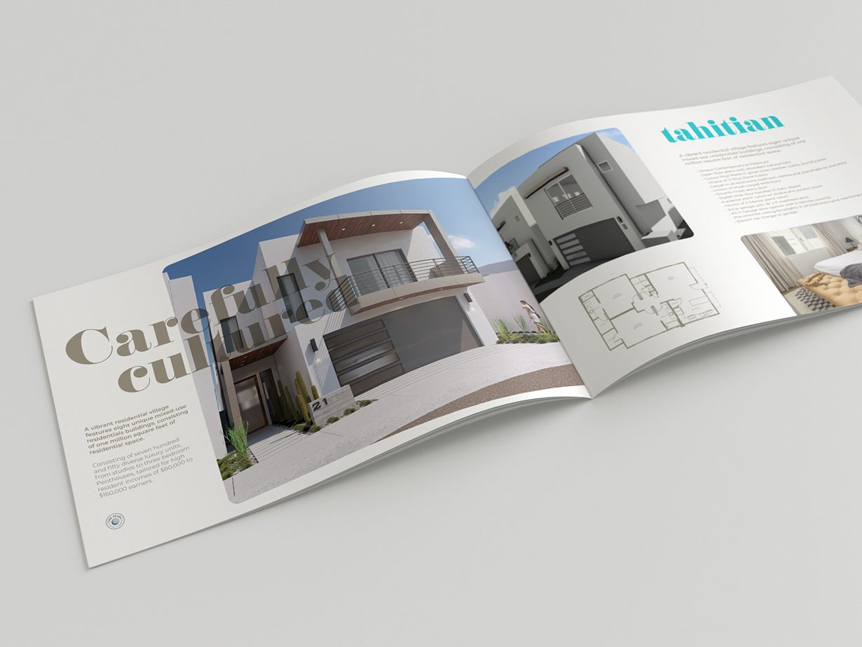
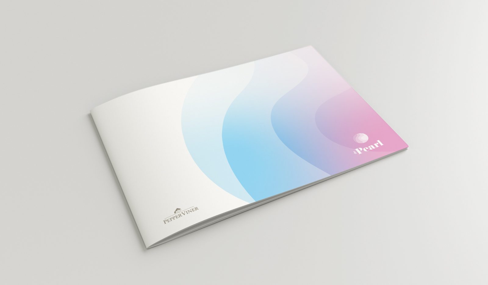
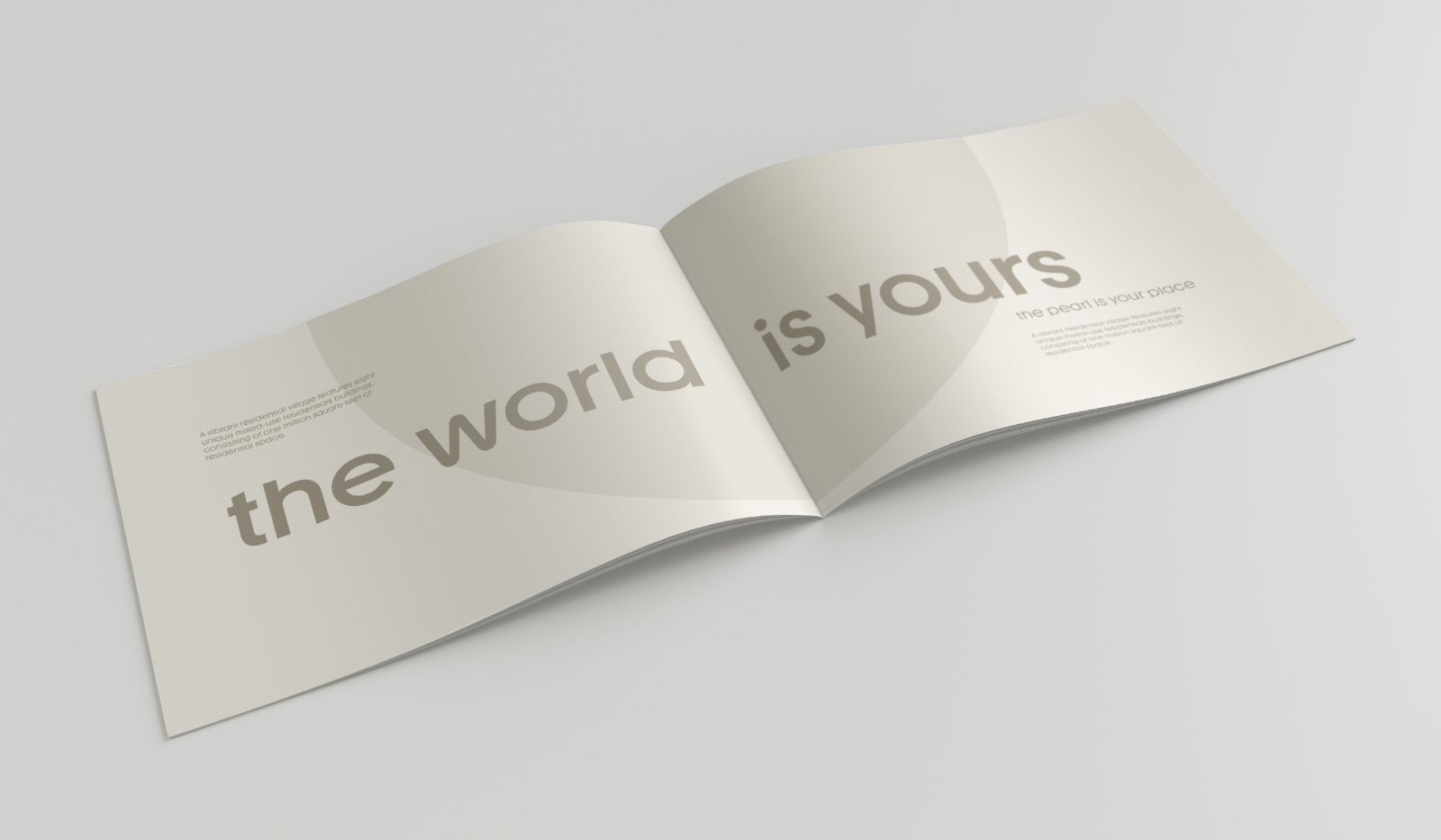
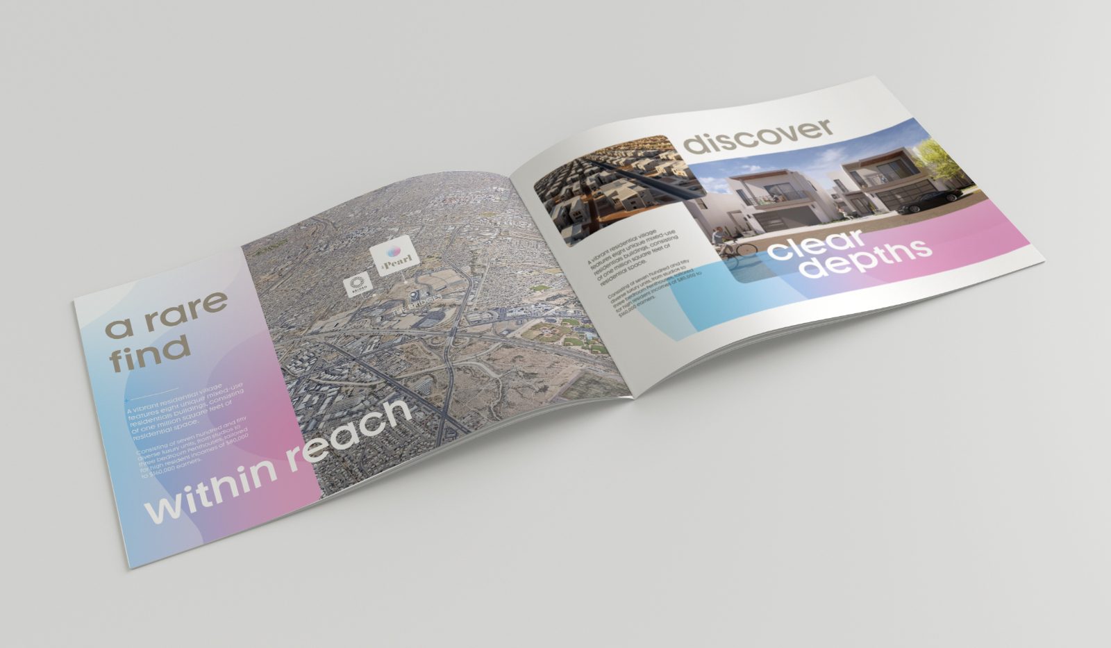
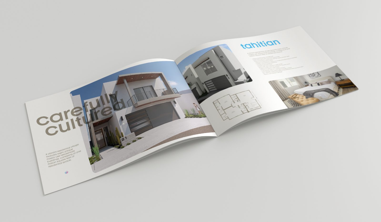
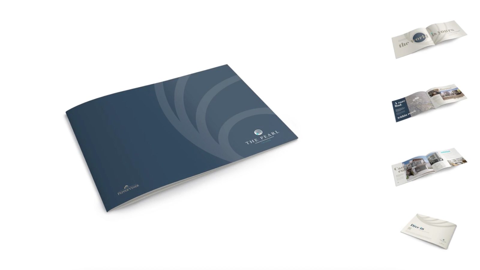
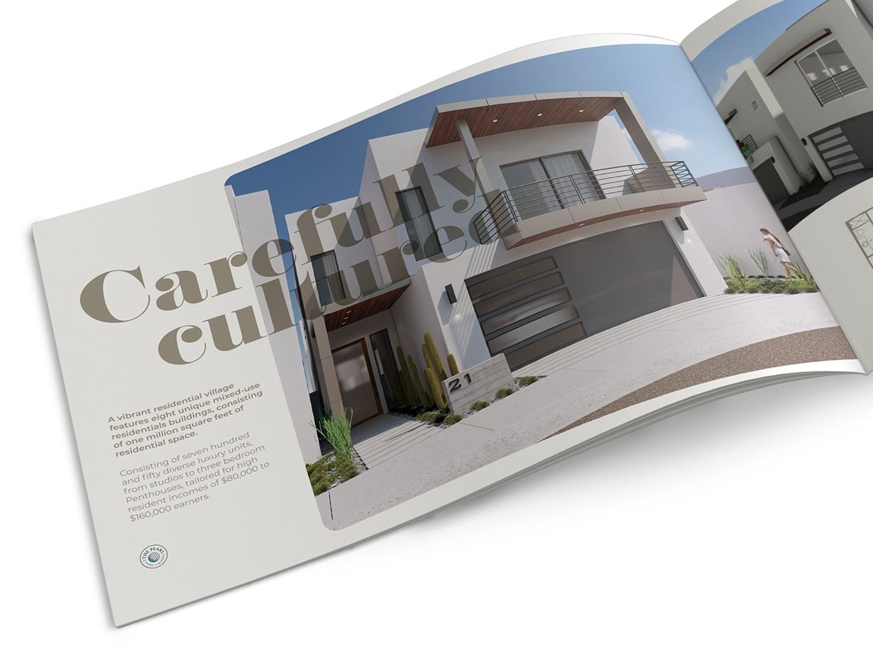
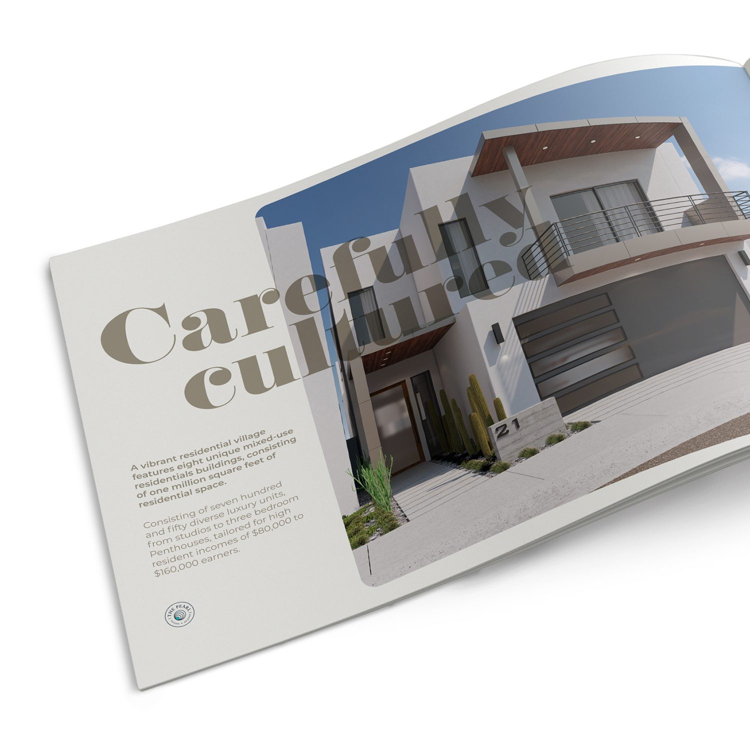
Brand creation for a new residential development — a name, an identity, and a sense of place built before the first slab was poured.
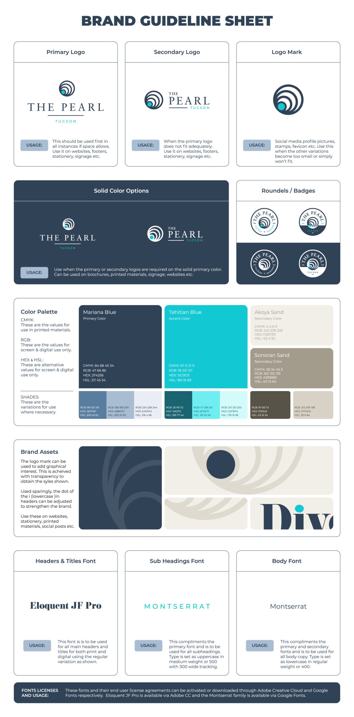
Guideline sheet scrolls in place.