[ Work ]
Swell logo

Swell

SwellHealthcare SaaSBrand DirectionContentProduct Marketing

Belonging. Being part of something bigger than a piece of software, seen and celebrated, not just serviced.

How do you expand beyond dental into other verticals without losing who you are?

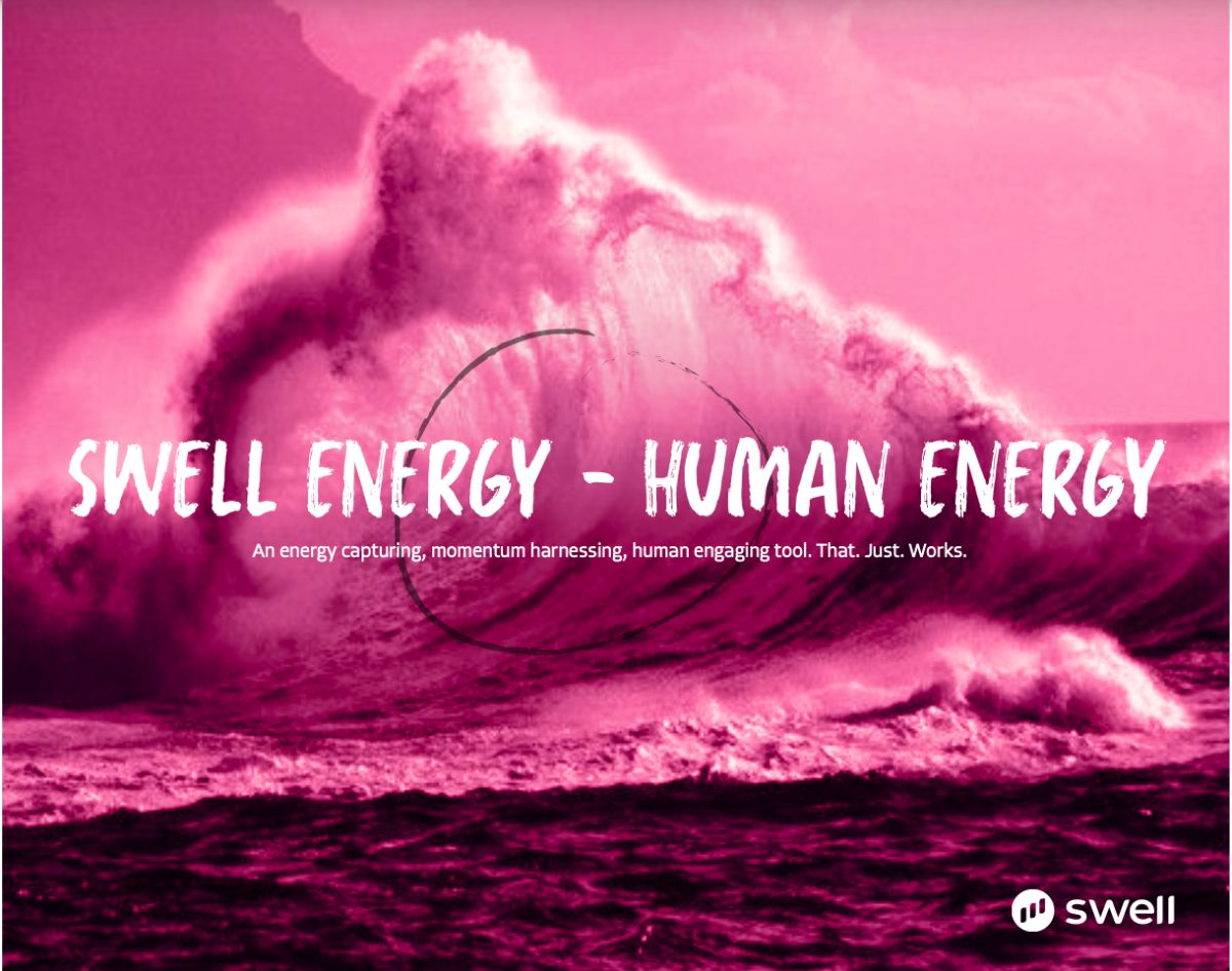
We played directly into the Swell name itself, a wave builds energy as it moves, and that became the organizing idea: a system that showcased small businesses in a way that made them feel heroic, not just referenced.

Every team below carried that same feeling, celebration, not just service, into a different vertical.

  • Leadershipworked directly with the CEO and CRO to land cross-vertical messaging before getting specific inside any one vertical.
  • Contentrepositioned existing case studies and built new ones through the momentum/celebration lens.
  • Productworked with web development to reskin the site so it actually reflected the reposition, not just described it.
  • Creativeredesigned copy and visual elements to lead with feeling, not function.

Expanded from one vertical to five within the first year, without losing the core positioning.
[ 01 ]Brand Design and Direction
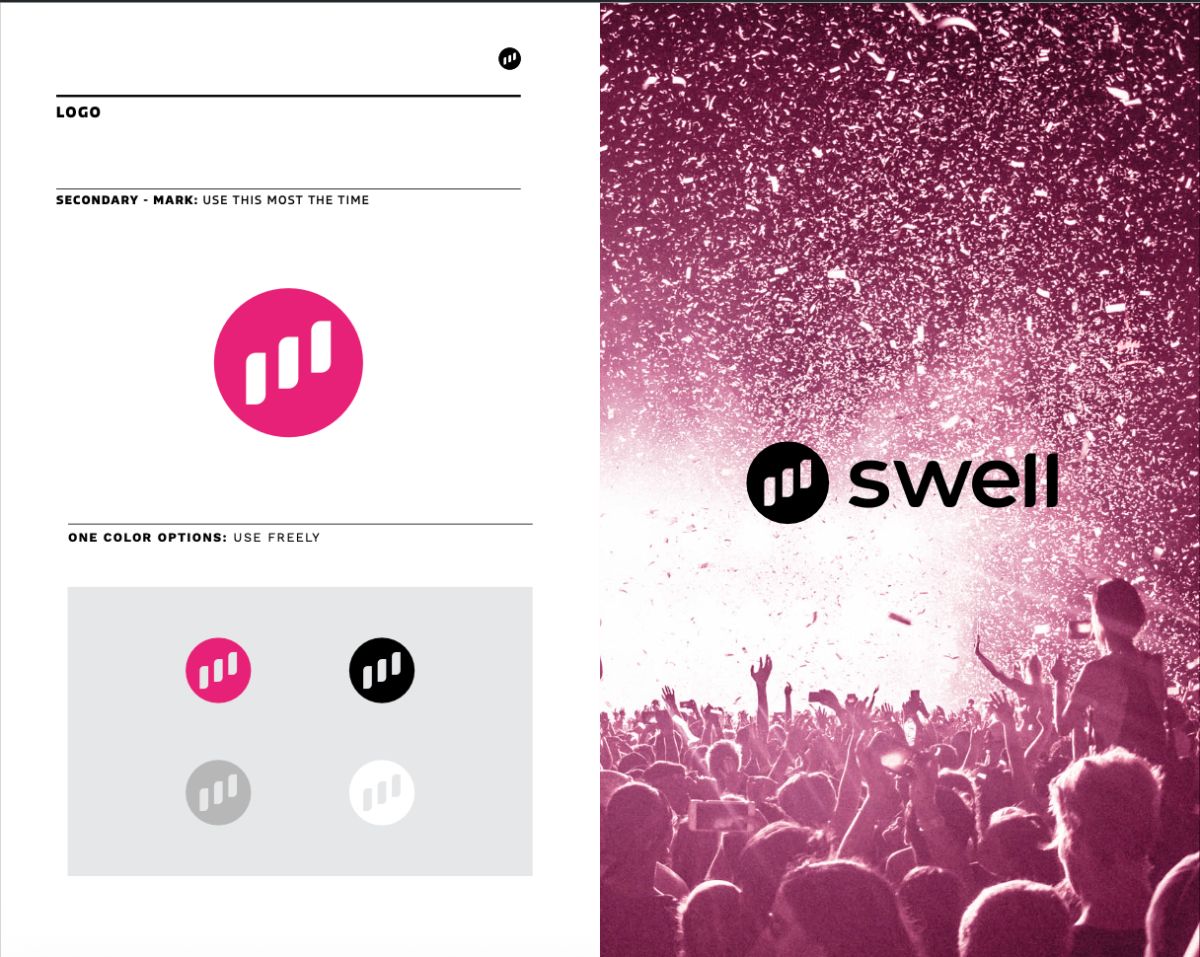
Logo direction
The feeling, mood direction
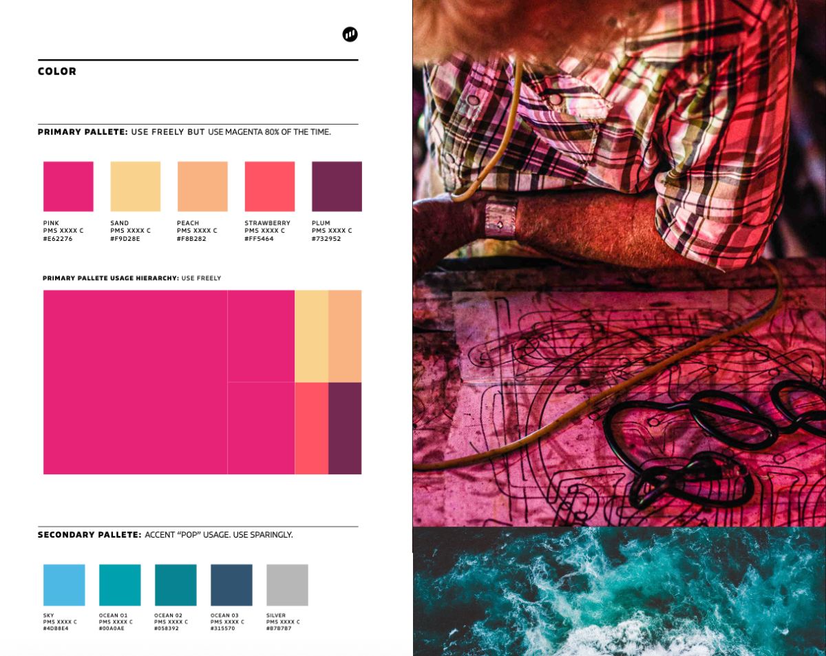
Color usage
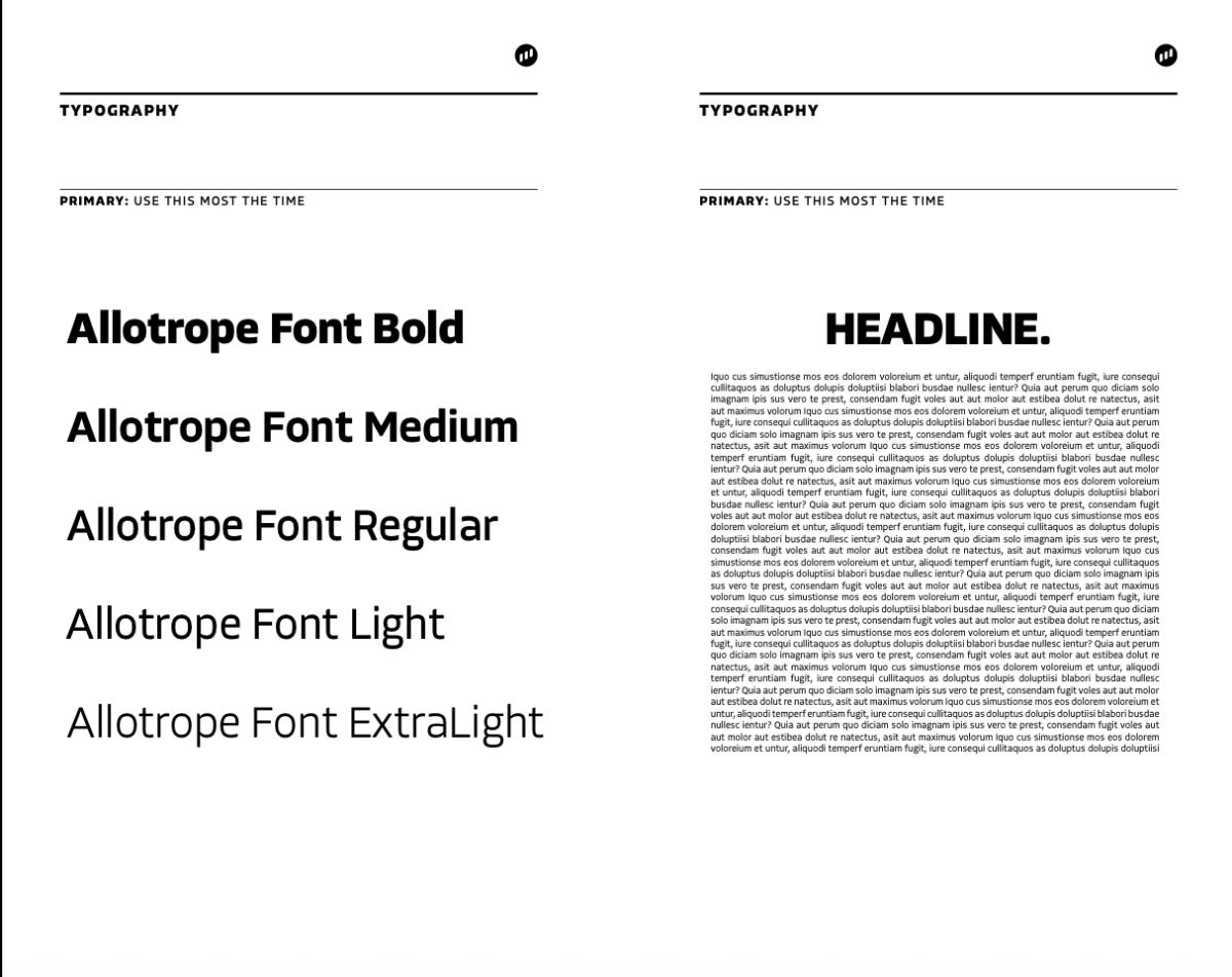
Typography
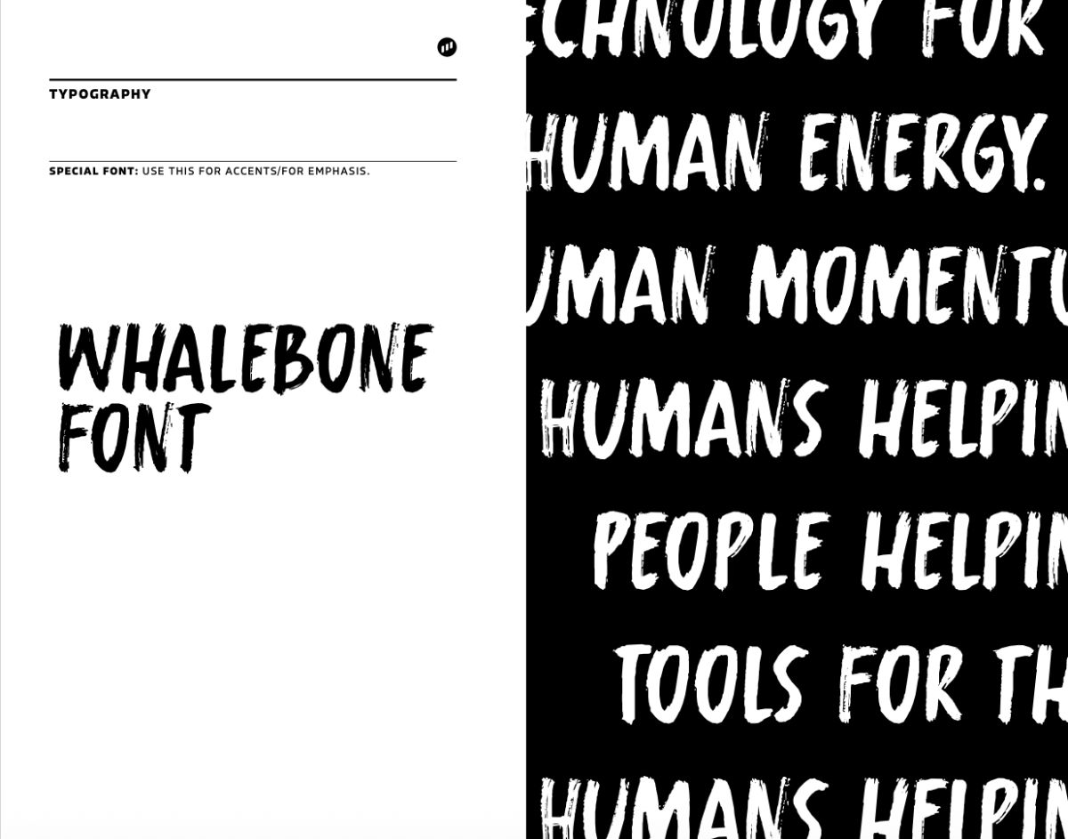
Type specimen
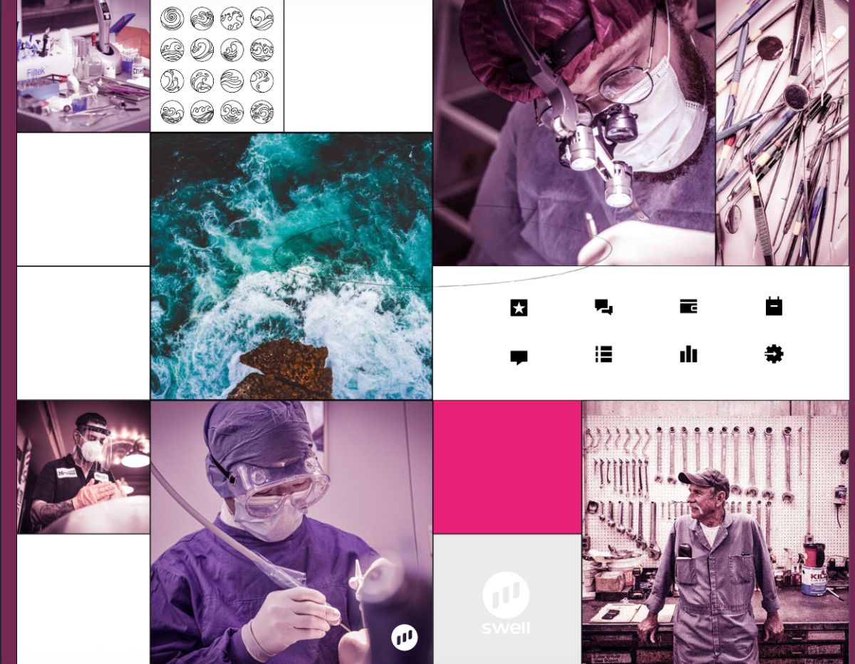
Photography direction
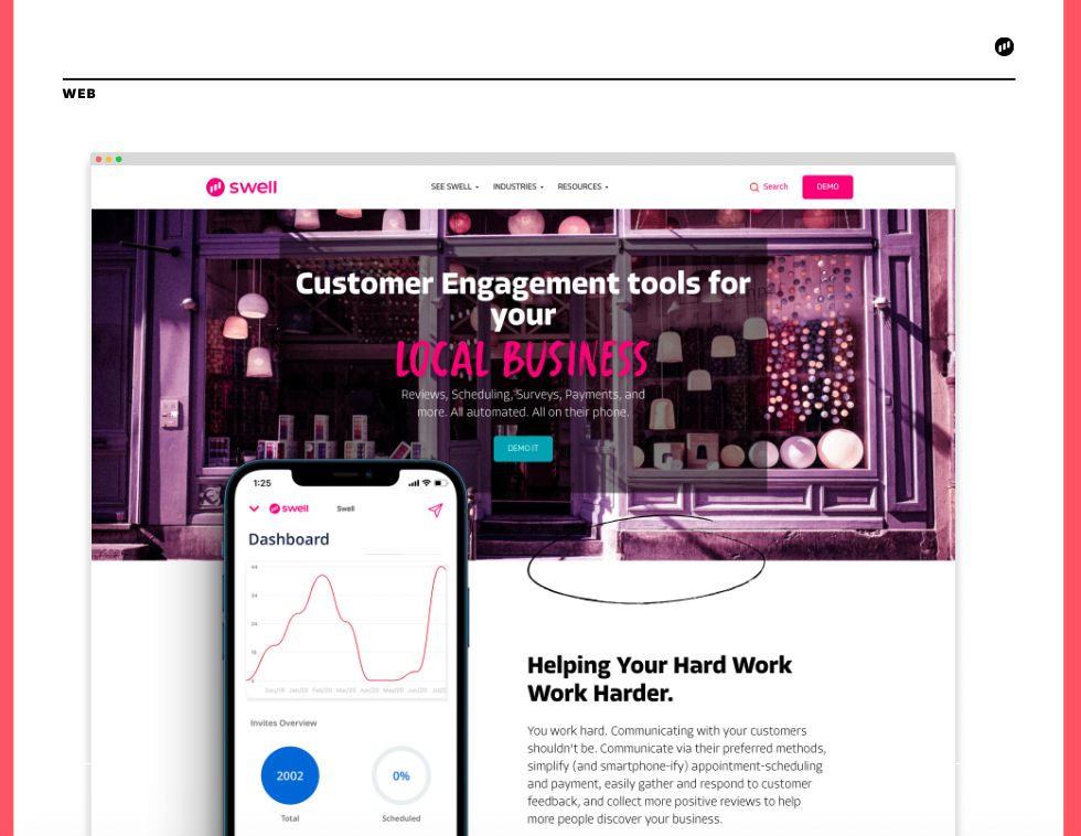
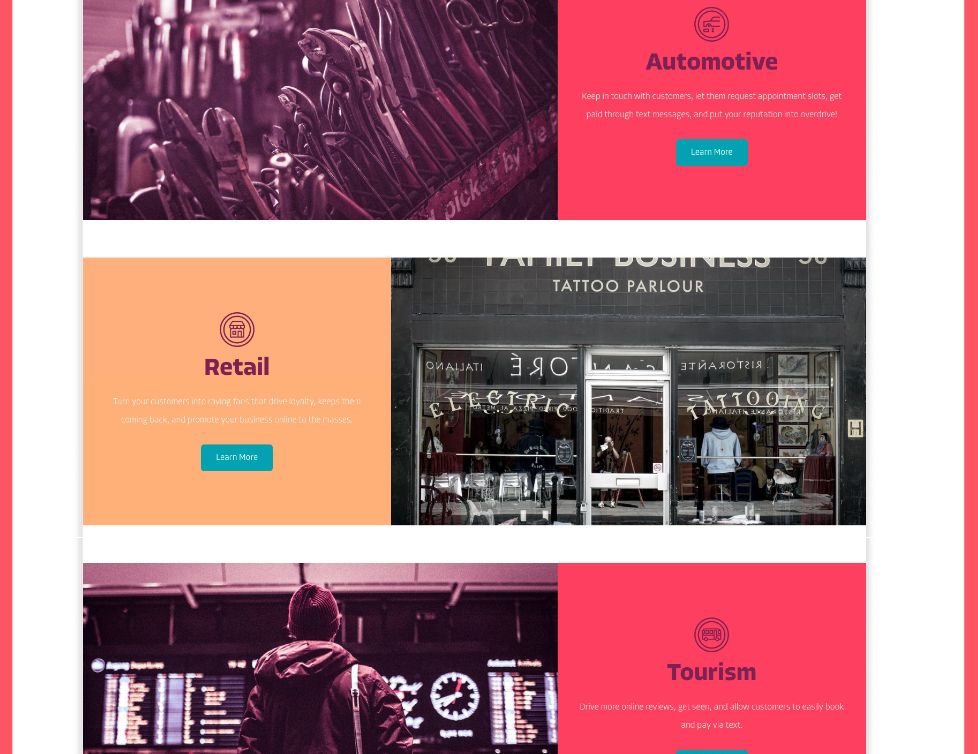
Website direction
Website direction
Brand essence artwork
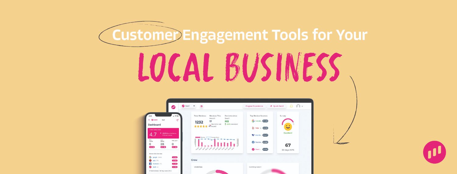
Facebook header
G2 banner
Social badges
[ 02 ]Product Mocks
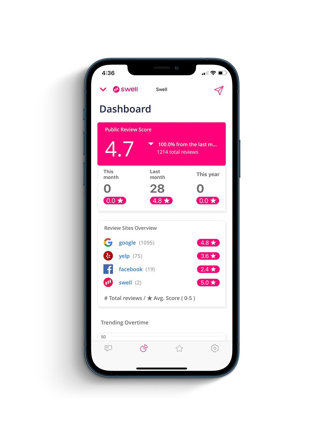
Swell dashboard on iPhone
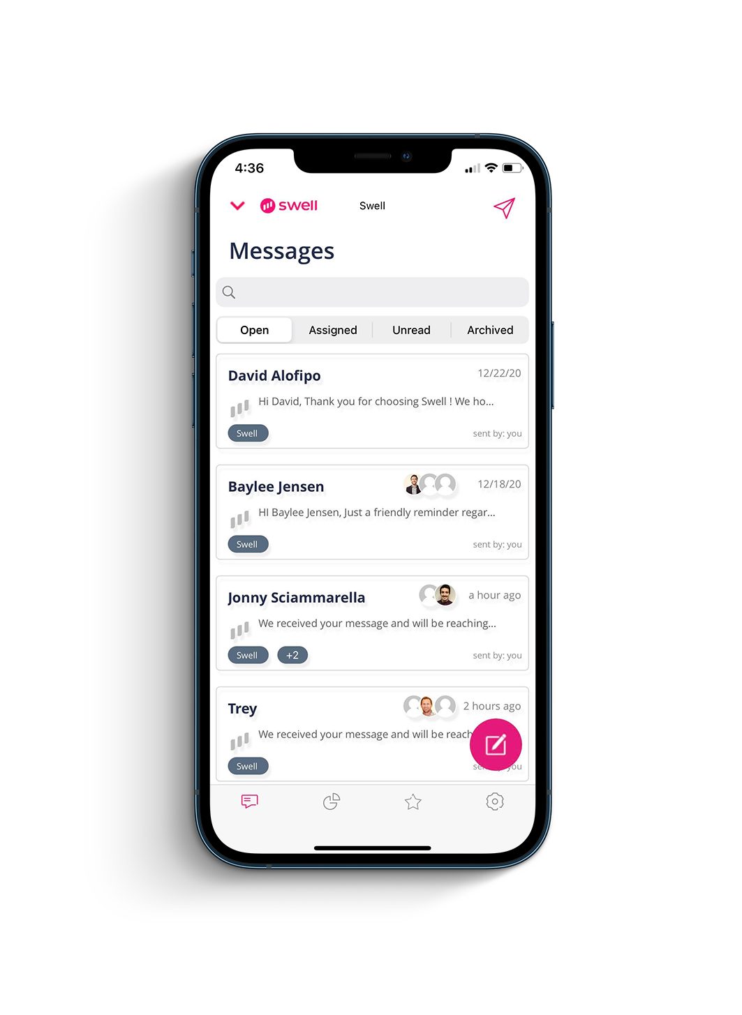
Swell messaging on iPhone
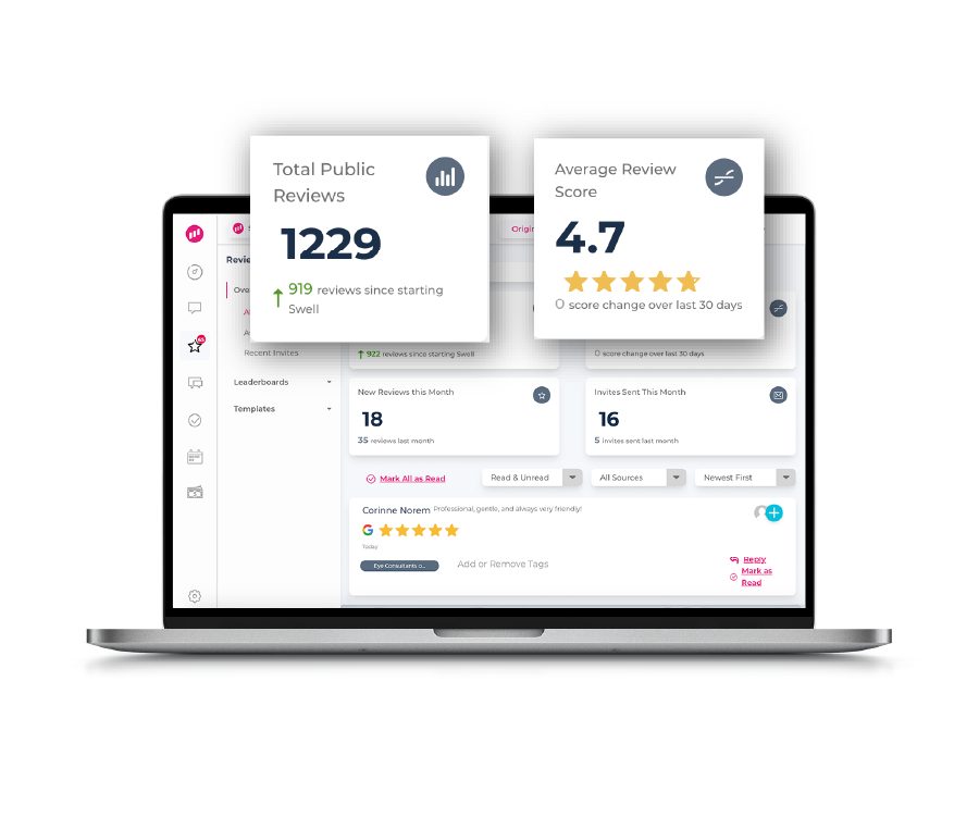
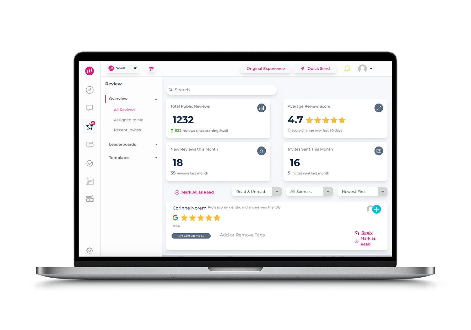
Reviews feature mock
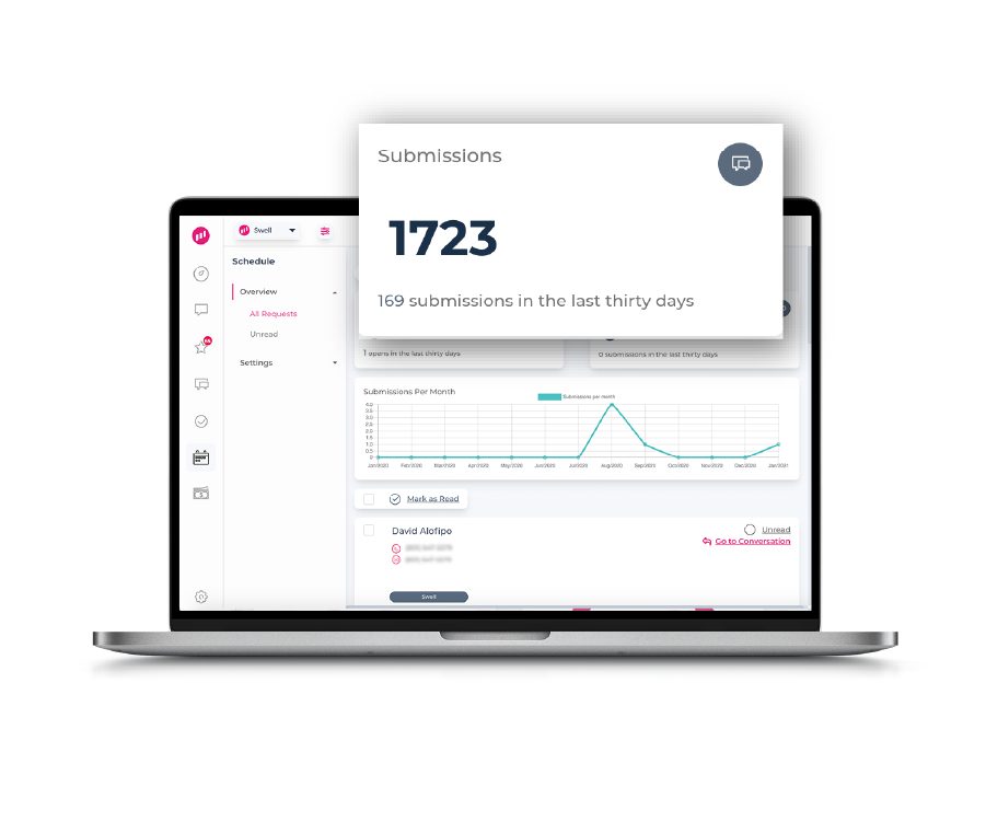
Scheduling feature mock
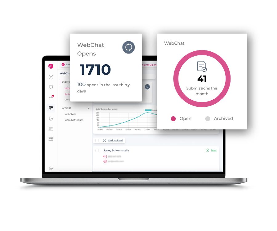
Webchat feature mock
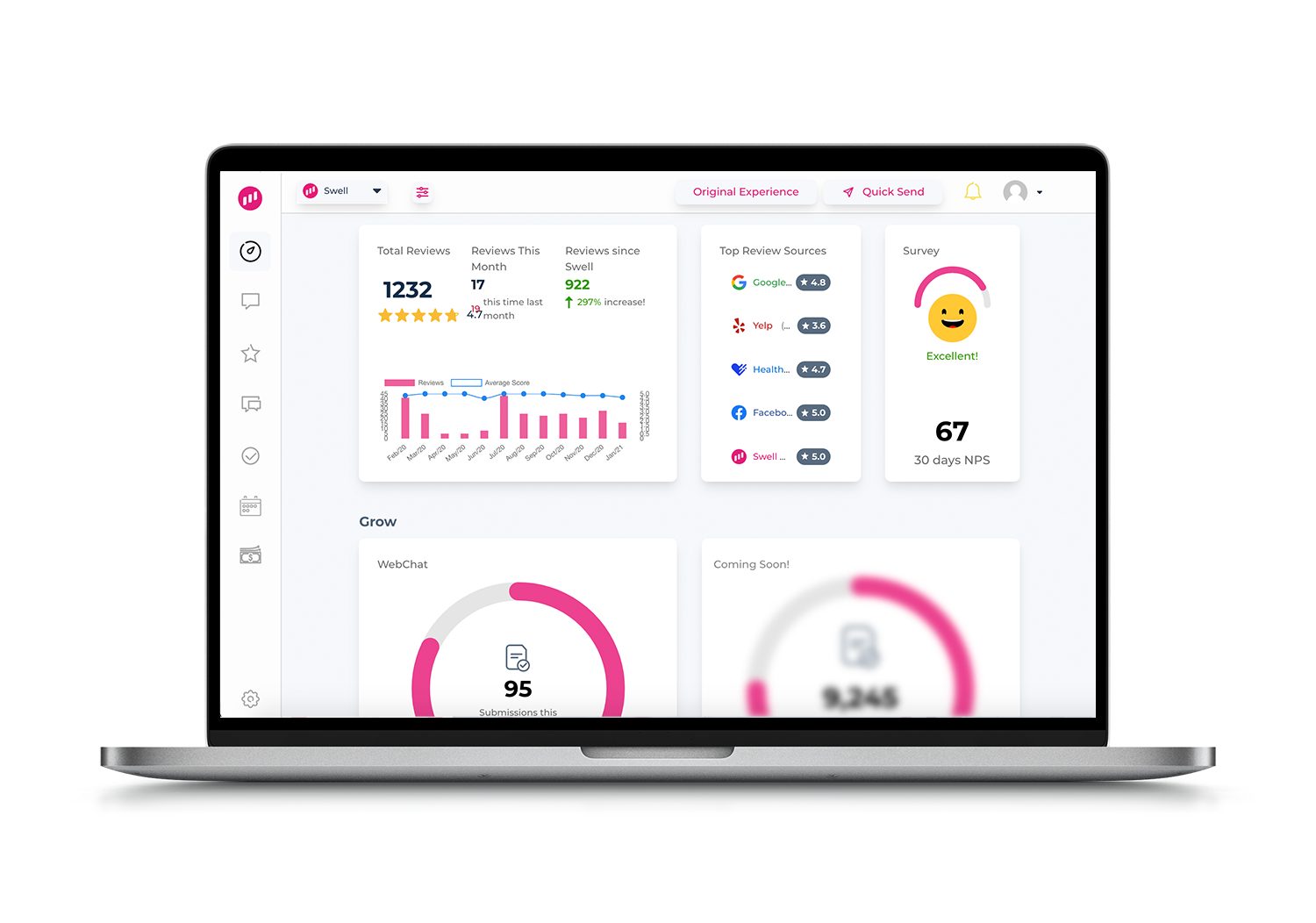
Insights dashboard
Reviews dashboard
[ 03 ]Content
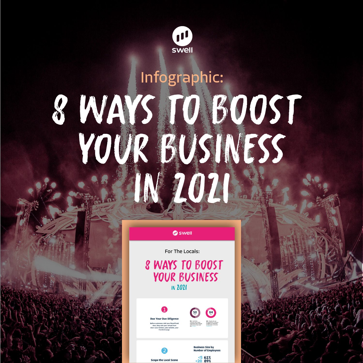
Landing page artwork
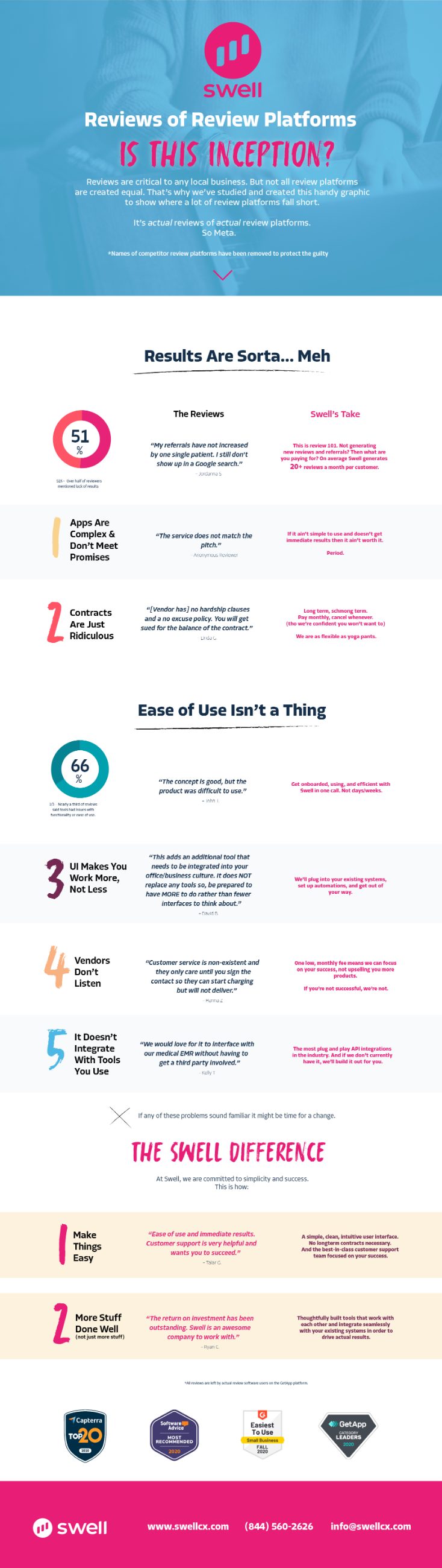
Patient experience infographic

Infographic scrolls in place.

Let's get real. And then scale it across your org.